

Front-End Web Development: A Complete Guide to Building Modern Website Interfaces


Front-end web development transforms written code into the interactive website interfaces that visitors see and use.
Every time a person visits a website, they are interacting with the work of front-end developers. The navigation menus they click, the forms they complete, the images that load on their screens, the animations that respond to their scrolling — all of these visible and interactive elements are produced through front-end web development.
Front-end development sits at the intersection of design and technology. It takes visual layouts created by designers and transforms them into working, interactive browser experiences using code. The result is what every website visitor actually sees and touches — the interface layer that makes a website feel professional, intuitive, and responsive.
Modern front-end web development requires far more than writing HTML and CSS. It involves JavaScript programming, responsive layout techniques, accessibility implementation, performance optimization, and proficiency with an evolving set of frameworks and development tools.
Businesses looking to establish a stronger online presence can explore the website design and development solutions offered by Apso Tech, where technical expertise and thoughtful design work together to create high-performing digital experiences.
This guide covers the core concepts, technologies, tools, and best practices that define modern front-end web development — from fundamental HTML structure to performance optimization and the future of the discipline.
What Is Front-End Web Development?
Front-end web development is the practice of building the client-side portions of a website — the parts that run in a user's web browser and that visitors directly see and interact with. It covers everything from the layout and styling of pages to the interactive behaviors that respond to user actions.
The key distinction in web development is between the frontend and the backend. Frontend development handles what happens in the browser — visual presentation, navigation, forms, animations, and interface interactions. Backend development handles what happens on the server — data storage, authentication, business logic, and the APIs that supply the frontend with information.
A front-end developer's responsibilities typically include translating visual designs into working web pages, writing HTML for content structure, CSS for visual styling, and JavaScript for interactivity, then ensuring the result works correctly across different browsers and devices.
Common front-end elements include navigation menus, hero banners, image galleries, contact forms, accordion panels, modal windows, product carousels, and any other interface component that a website visitor directly engages with.
Which Core Technologies Power Front-End Web Development?
Three foundational technologies underpin every website interface. Understanding how each works — and how they collaborate — is the starting point for all front-end web development.
HTML — Structure
HyperText Markup Language (HTML) defines the structure and content of every web page. It uses a system of elements and tags to organize text, images, links, forms, tables, and all other content types into a logical hierarchy that both browsers and search engines can read and interpret accurately.
Semantic HTML is particularly important in modern front-end web development. Using elements such as <header>, <nav>, <main>, <article>, and <footer> in their correct context communicates the meaning and purpose of content to browsers, assistive technologies, and search engine crawlers.
CSS — Presentation
Cascading Style Sheets (CSS) control the visual appearance of every HTML element on a page. Colors, typography, spacing, borders, background images, grid layouts, flexbox arrangements, animations, and responsive breakpoints are all defined through CSS.
Well-organized CSS uses reusable classes, logical naming conventions, and modular component structures to ensure that styles remain manageable as a website grows. CSS custom properties and preprocessors such as Sass further extend what CSS can achieve.
JavaScript — Interactivity
JavaScript is the programming language of the web browser. It allows front-end developers to respond to user events (clicks, key presses, form submissions), manipulate the Document Object Model (DOM) to update page content dynamically, fetch data from APIs, and create the animated, interactive experiences that modern website visitors expect.
Together, HTML, CSS, and JavaScript form a complete front-end development stack. HTML provides the content skeleton, CSS dresses it in visual design, and JavaScript brings it to life with behavior and interactivity.

HTML, CSS, and JavaScript each serve a distinct and essential role in building complete, interactive website interfaces.
Which Frameworks and Libraries Are Used in Front-End Web Development?
As websites have grown more complex, the front-end web development community has built a rich ecosystem of frameworks and libraries that accelerate development, enforce structure, and simplify the creation of sophisticated user interfaces.
-
React — Developed by Meta, React is the most widely adopted JavaScript library for building component-based user interfaces. It allows developers to create reusable UI components and manage application state efficiently, making it ideal for complex, data-driven websites and web applications.
-
Angular — Developed by Google, Angular is a comprehensive TypeScript-based framework that enforces a structured architecture for large-scale applications. Its built-in tools for routing, state management, and dependency injection make it well-suited to enterprise-level front-end web development projects.
-
Vue.js — Vue.js offers a flexible, progressive approach to building interfaces. It is approachable for developers working on smaller projects while also scaling effectively for complex applications, making it a popular choice across a wide range of front-end web development contexts.
-
Bootstrap — Bootstrap is a CSS framework that provides a responsive grid system, pre-built UI components, and utility classes that allow developers to build consistent, mobile-ready layouts rapidly without writing extensive custom CSS.
-
jQuery — Although less central to modern front-end development than it once was, jQuery remains in widespread use for DOM manipulation, event handling, and AJAX requests in existing websites and projects that pre-date newer framework adoption.
The selection of a framework depends on the project's scale, the team's existing expertise, the complexity of required interactivity, long-term performance requirements, and how the application will be maintained over time.
How Does Front-End Web Development Turn Designs into Interactive Websites?
Converting a visual design into a working, interactive website is the core practical task of front-end web development. For businesses interested in combining polished website interfaces with complete development solutions, these web design and development services demonstrate how design and technical implementation work together.
The process typically follows these six stages:
-
Design Analysis — The developer reviews the approved layouts, component specifications, typography scales, color tokens, spacing values, and interactive states provided by the UI/UX designer, usually delivered via Figma or a similar design tool.
-
HTML Structure — The developer writes the semantic HTML markup for each page, organizing content into a logical hierarchy that is accessible, meaningful, and correctly structured for both browsers and search engines.
-
CSS Styling — Visual styles are applied using CSS — layout systems (flexbox or grid), color schemes, typography, spacing, hover states, and animations — with responsive breakpoints implemented using media queries.
-
JavaScript Integration — Interactive behaviors are added: navigation toggles, form validation, modal dialogs, data fetching from APIs, animated transitions, and any other dynamic functionality specified in the design.
-
Responsive Implementation — The interface is tested and adjusted to work correctly across all target screen sizes, from large desktop monitors to small smartphone screens, following mobile-first development principles.
-
Testing and Refinement — The completed interface is tested across multiple browsers (Chrome, Firefox, Safari, Edge) and devices to identify and resolve any compatibility issues, layout inconsistencies, or JavaScript errors before launch.
Why Is Responsive Design Essential in Front-End Web Development?
Responsive design is the approach of building website interfaces that automatically adapt their layout, typography, and content presentation to suit the screen size of the device being used. It is not an optional feature in modern front-end web development — it is a fundamental requirement.
-
Mobile-first development — The mobile-first approach means designing and coding the mobile layout first, then progressively enhancing it for larger screens. This ensures the most constrained experience is prioritized, resulting in leaner, more performant base code.
-
CSS media queries and flexible grids — Media queries allow developers to define CSS rules that apply only at specific screen width ranges. Combined with flexible grid systems using percentages or CSS Grid, they enable layouts that reflow elegantly across breakpoints.
-
Responsive images — The <picture> element and srcset attribute allow developers to serve different image sizes based on screen resolution and display density, preventing the delivery of oversized images to small screens.
-
Scalable typography — Using relative units such as rem, em, and viewport-relative units (vw, vh) for font sizes ensures that text scales appropriately across different devices and respects user browser preferences.
-
Touch-friendly navigation — Interactive elements such as buttons, links, and form controls must be sized and spaced sufficiently for touch input, with minimum touch target sizes recommended at 44 × 44 pixels.
-
Cross-device testing — Thorough testing across physical devices and browser emulators is essential to identify responsive layout issues that may not be visible on a single development screen.
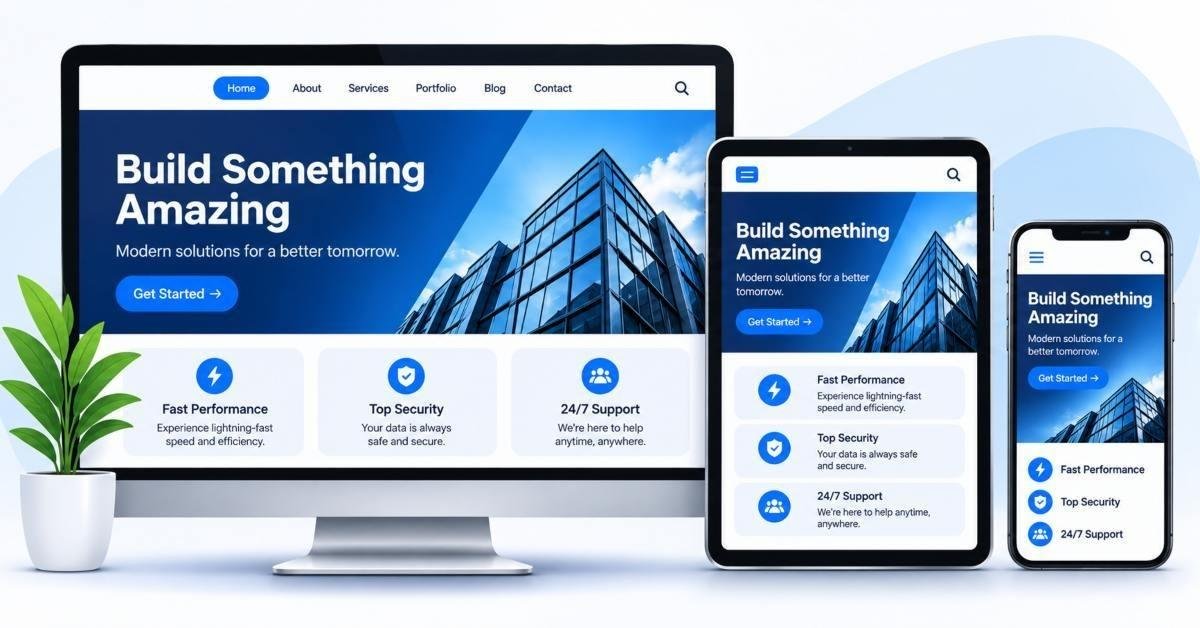
Responsive front-end web development ensures interfaces adapt seamlessly to every screen size and device type.
How Does Front-End Web Development Improve Website Performance?
Website loading speed is a critical factor in both user experience and search engine ranking. Front-end web development decisions made during the build phase have a direct and lasting impact on how quickly pages load and how smoothly interfaces respond to user interactions.
-
Image compression and modern formats — Images are typically the largest contributors to page weight. Compressing images and using modern formats such as WebP and AVIF significantly reduces file sizes without visible quality loss.
-
CSS and JavaScript minification — Removing whitespace, comments, and redundant characters from CSS and JavaScript files reduces their transfer size, speeding up initial page load times.
-
Lazy loading — The loading="lazy" attribute on images and iframes defers their loading until they are about to enter the viewport, reducing the amount of data downloaded on initial page load.
-
Reducing unnecessary scripts and dependencies — Every third-party script added to a page carries a performance cost. Front-end developers audit dependencies regularly and remove unused libraries, plugins, and tracking scripts.
-
Browser caching — Configuring appropriate cache headers allows browsers to store static assets locally, so returning visitors download fewer files on subsequent visits.
-
Performance testing — Tools such as Google Lighthouse, WebPageTest, and Chrome DevTools Performance panel provide detailed diagnostics that guide front-end optimization decisions throughout development.
How Does Accessibility Influence Front-End Web Development?
Accessible front-end web development ensures that website interfaces can be used effectively by all visitors, including those who rely on assistive technologies such as screen readers, keyboard navigation, or voice control. Accessibility is not an add-on — it is a core quality standard for professional front-end work.
-
Semantic HTML and meaningful structure — Using correct HTML elements for their intended purpose — headings for structure, buttons for actions, links for navigation — provides assistive technologies with accurate information about how to present and interact with content.
-
Keyboard navigation and focus indicators — All interactive elements must be operable using only a keyboard. Visible focus styles ensure keyboard users can always see which element is currently active.
-
Descriptive labels and alternative text — Form inputs require descriptive labels, images require meaningful alt text, and icon-only buttons require accessible names so screen reader users receive complete information.
-
Color contrast and readable typography — The Web Content Accessibility Guidelines (WCAG) specify minimum contrast ratios between text and background colors to ensure readability for users with low vision or color deficiency.
-
Screen reader accommodation — ARIA (Accessible Rich Internet Applications) attributes supplement HTML semantics for complex interactive components such as carousels, tabs, and modals that have no native HTML equivalent.
-
Accessibility testing throughout development — Automated tools such as axe and Lighthouse accessibility audits, combined with manual keyboard and screen reader testing, identify and resolve accessibility issues before launch.
What Tools Do Developers Use in Front-End Web Development?
A well-equipped front-end developer uses a consistent set of tools throughout the development workflow — from initial design review to final performance testing. These tools support cleaner code, faster debugging, better collaboration, and more reliable results.
-
Visual Studio Code — The most widely used code editor for front-end web development, offering syntax highlighting, intelligent code completion, integrated terminal access, and a vast library of extensions for every common framework and technology.
-
Chrome DevTools — The browser developer tools built into Google Chrome allow developers to inspect HTML and CSS in real time, debug JavaScript, simulate device screen sizes, audit performance, and analyze network requests.
-
Git and GitHub — Version control with Git allows developers to track code changes, work in parallel branches, and collaborate with teammates without overwriting each other's work. GitHub provides a hosted platform for repositories, code reviews, and project management.
-
npm (Node Package Manager) — npm is the standard tool for installing, managing, and updating JavaScript packages and development dependencies, from build tools and linters to framework libraries and testing utilities.
-
Figma — Figma is the industry-standard tool for reviewing design specifications, inspecting component dimensions and styles, exporting assets, and collaborating with designers throughout the front-end implementation process.
-
Browser testing tools — Services such as BrowserStack and cross-browser developer tools allow developers to test website interfaces across multiple browsers, operating systems, and device configurations without maintaining a physical test lab.

The front-end developer workflow from design review through HTML, CSS, JavaScript, testing, and optimization to launch.
What Are the Common Challenges in Front-End Web Development?
Front-end web development presents a consistent set of technical and organizational challenges that developers navigate on every project. Awareness of these challenges helps teams plan more effectively and deliver better results.
-
Maintaining browser compatibility — Different browsers implement web standards differently, and older browser versions may not support modern CSS or JavaScript features, requiring polyfills or fallback strategies.
-
Managing complex CSS layouts — As projects grow, CSS can become difficult to maintain without disciplined organizational strategies such as BEM naming conventions or CSS-in-JS solutions.
-
Debugging JavaScript errors — JavaScript errors can appear only in specific browsers, only under certain user interactions, or only with particular data — making them time-consuming to reproduce and fix consistently.
-
Optimizing website loading speed — Achieving strong Core Web Vitals scores requires ongoing attention to image sizes, script loading order, render-blocking resources, and third-party tag management.
-
Maintaining consistent user interfaces — Ensuring visual and behavioral consistency across a large website with many pages and components requires thorough design systems and disciplined implementation practices.
-
Managing third-party libraries and dependencies — Outdated or abandoned dependencies introduce security vulnerabilities and compatibility risks that require regular auditing and updating throughout a project's lifecycle.
-
Ensuring accessibility across different devices — Meeting accessibility standards consistently across a range of browsers, assistive technologies, and device types requires sustained testing and a commitment to inclusive development practices.
What Are the Best Practices for Modern Front-End Web Development?
Following established best practices ensures that front-end code is maintainable, performant, accessible, and built to last — qualities that matter both during active development and throughout the long-term life of a website.
-
Write clean, readable, and reusable code — use descriptive variable names, meaningful comments, and modular component structures that other developers can understand and extend
-
Use semantic HTML elements in their correct context, reinforcing both accessibility and search engine optimization simultaneously
-
Organize CSS into manageable, logical components using consistent naming conventions and avoiding deeply nested selectors
-
Follow mobile-first responsive design principles, building the smallest viewport experience first and scaling upward
-
Optimize images and scripts before deployment — compress files, use modern formats, defer non-critical scripts, and lazy-load below-the-fold content
-
Use version control throughout every project, committing changes regularly with descriptive messages and working in feature branches
-
Test interfaces across multiple browsers, devices, and screen sizes before every significant release
-
Follow WCAG accessibility guidelines and test with keyboard navigation and screen readers as part of the standard development process
-
Keep all frameworks, libraries, and development dependencies updated to their latest stable versions to maintain security and compatibility
What Is the Future of Front-End Web Development?
Front-end web development continues to evolve rapidly, shaped by advances in browser technology, shifting user expectations, and the growing demands of web applications that rival native software in complexity and capability.
-
AI-assisted coding tools — Tools such as GitHub Copilot and AI-powered code completion are changing how developers write front-end code, accelerating routine tasks and reducing the time spent on boilerplate implementation.
-
Component-driven development — Design systems and component libraries are becoming the standard approach for maintaining visual consistency and development efficiency at scale across large digital products.
-
Progressive Web Applications (PWAs) — PWAs bring native app capabilities — offline support, push notifications, home screen installation — to browser-based front-end experiences without requiring app store distribution.
-
Server-side rendering and modern rendering approaches — Frameworks such as Next.js and Nuxt.js blur the boundary between frontend and backend, delivering faster initial page loads and better SEO through server-rendered React and Vue components.
-
WebAssembly — WebAssembly allows high-performance code written in languages such as C, C++, and Rust to run in the browser alongside JavaScript, opening new possibilities for computationally intensive front-end applications.
-
Growing importance of performance and accessibility — As Core Web Vitals become more influential in search rankings and accessibility legislation expands globally, performance and inclusivity are becoming non-negotiable baseline requirements in front-end web development.
Conclusion: Building Better Digital Experiences Through Front-End Web Development
Front-end web development is the discipline that makes websites real — transforming visual concepts and business requirements into the interactive, accessible, and performant interfaces that people use every day. It is a practice that sits at the technical heart of every web project, regardless of its size or complexity.
HTML, CSS, and JavaScript remain the irreplaceable foundation. Frameworks like React, Angular, and Vue.js extend what is possible. Responsive design ensures interfaces reach every user. Accessibility standards guarantee no one is excluded. Performance optimization keeps experiences fast and competitive.
For developers at every stage of their career, the most important investment is continuous learning. Front-end web development evolves quickly, and the developers who deliver the best digital experiences are those who stay current with emerging standards, test their work rigorously, follow established best practices, and always build with the end user in mind.


